Melbourne’s Melting Point
By Helen Walpole, RMIT University.
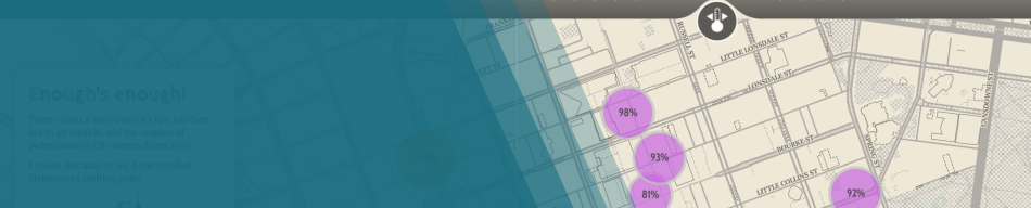
See the projectThe brief for this map was to tell a story using pedestrian count data from the City of Melbourne’s open data portal. I joined the pedestrian data with daily maximum temperature observations to answer the question ‘How hot is too hot in Melbourne’s central business district?’. I aggregated the data into weekdays and weekends to account for behavioural patterns, and used proportional symbols to represent pedestrian activity at various locations. The data visualisation is further supported by a temperature slider, map swipe and graphs. Text and legend materials are kept to a minimum and the map provides the user with multiple levels of interaction (hover, swipe, slide) to encourage exploration and discovery. Users can draw their own conclusion about Melbourne’s melting point, though a colour change in the banner provides a subtle data-driven conclusion.
